

 在duyu200上体验eTS-警告弹窗
描述
今天开发板到手了,于是想体验一些新的东西。于是就从弹窗做起。
显示警告弹窗组件,可设置文本内容与响应回调。 从API Version 7开始支持
属性
| 名称 | 参数类型 | 默认值 | 参数描述 |
|---|---|---|---|
| show | options: { paramObject1| paramObject2} | - | 定义并显示AlertDialog组件 |
paramObject1参数
| 参数名 | 参数类型 | 必填 | 默认值 | 参数描述 |
|---|---|---|---|---|
| title | string | 否 | - | 弹窗标题。 |
| message | string | 是 | - | 弹窗内容。 |
| autoCancel | boolean | 否 | true | 点击遮障层时,是否关闭弹窗。 |
| confirm | { value: string |, fontColor?: Color | number | string | , backgroundColor?: Color | number | string | , action: () => void } | 否 | - | 确认按钮的文本内容、文本色、按钮背景色和点击回调。 |
| cancel | () => void | 否 | - | 点击遮障层关闭dialog时的回调。 |
| alignment | DialogAlignment | 否 | DialogAlignment.Default | 弹窗在竖直方向上的对齐方式。 |
| offset | { dx: Length | , dy: Length | } | 否 | - | 弹窗相对alignment所在位置的偏移量。 |
| gridCount | number | 否 | - | 弹窗容器宽度所占用栅格数。 |
paramObject2参数
| 参数名 | 参数类型 | 必填 | 默认值 | 参数描述 |
|---|---|---|---|---|
| title | string | 否 | - | 弹窗标题。 |
| message | string | 是 | - | 弹窗内容。 |
| autoCancel | boolean | 否 | true | 点击遮障层时,是否关闭弹窗。 |
| primaryButton | { value: string | fontColor?: Color | number | string | , backgroundColor?: Color | number | string | , action: () => void; } | 否 | - | 按钮的文本内容、文本色、按钮背景色和点击回调。 |
| secondaryButton | { value: string | , fontColor?: Color | number | string | , backgroundColor?: Color | number | string | , action: () => void; } | 否 | - | 按钮的文本内容、文本色、按钮背景色和点击回调。 |
| cancel | () => void | 否 | - | 点击遮障层关闭dialog时的回调。 |
| alignment | DialogAlignment | 否 | DialogAlignment.Default | 弹窗在竖直方向上的对齐方式。 |
| offset | { dx: Length | , dy: Length |} | 否 | - | 弹窗相对alignment所在位置的偏移量。 |
| gridCount | number | 否 | - | 弹窗容器宽度所占用栅格数。 |
案例
@Entry
@Component
struct AlertDialogExample {
build() {
Column({ space: 50}) {
Button('one button')
.onClick(() => {
AlertDialog.show(
{
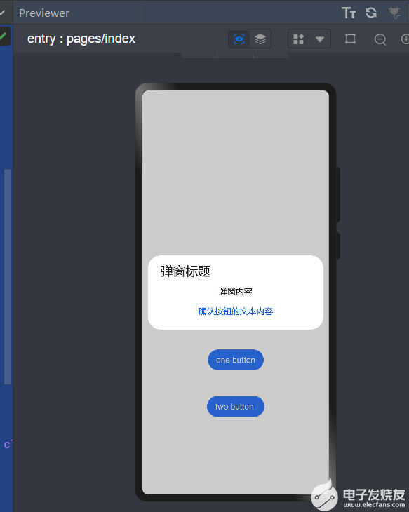
title: '弹窗标题',
message: '弹窗内容',
autoCancel:false,
confirm: {
value: '确认按钮的文本内容',
action: () => {
console.info('Button-clicking callback')
}
},
cancel: () => {
console.info('Closed callbacks')
}
}
)
})
.backgroundColor(0x317aff)
Button('two button ')
.onClick(() => {
AlertDialog.show(
{
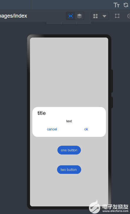
title: 'title',
message: 'text',
primaryButton: {
value: 'cancel',
action: () => {
console.info('Callback when the first button is clicked')
}
},
secondaryButton: {
value: 'ok',
action: () => {
console.info('Callback when the second button is clicked')
}
},
cancel: () => {
console.info('Closed callbacks')
}
}
)
}).backgroundColor(0x317aff)
}.width('100%').margin({ top: 500 })
}
}
效果图:

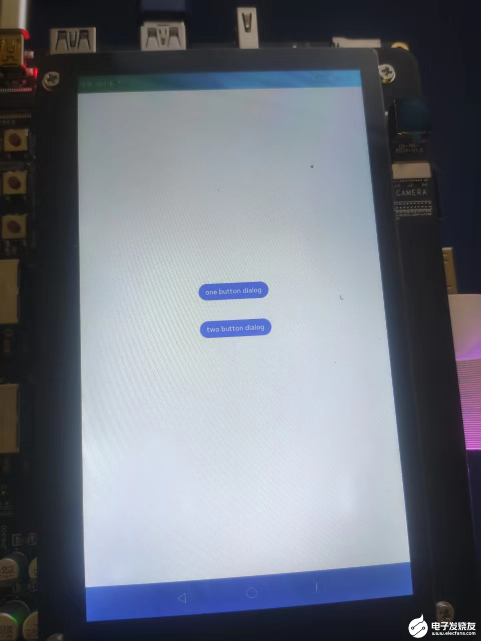
然后我们可以运行在真机上。
声明:本文内容及配图由入驻作者撰写或者入驻合作网站授权转载。文章观点仅代表作者本人,不代表电子发烧友网立场。文章及其配图仅供工程师学习之用,如有内容侵权或者其他违规问题,请联系本站处理。
举报投诉
- 相关推荐
- 热点推荐
- 开发板
- OpenHarmony
-
鸿蒙非侵入式弹窗新解法,企查查正式开源“QuickDialog”弹窗组件库2025-07-31 966
-
HarmonyOS实战:首页多弹窗顺序弹出终极解决方案2025-06-09 1016
-
HarmonyOS开发案例:【多种样式弹窗】2024-05-08 2080
-
HarmonyOS实战开发-如何使用全局状态保留能力弹窗来实现评论组件。2024-05-07 483
-
鸿蒙ArkUI开发-应用添加弹窗2024-01-24 2097
-
在OpenHarmony上如何使用不同的弹窗2023-06-18 2336
-
深入浅出学习eTs之电量不足提示弹窗实例2023-05-13 2459
-
关于WinCC弹窗制作的内容2022-11-02 14075
-
ArkUI如何自定义弹窗(eTS)2022-08-31 4221
-
基于ArkUI eTS开发的坚果笑话(NutJoke)2022-08-19 2513
-
基于eTS的HamronyOS应用开发2022-07-15 2883
-
XPopup的常用几种弹窗案例演示2022-03-28 742
-
HarmonyOS应用开发-eTS-警告弹窗2021-12-22 2177
-
iPhone11系列通过第三方机构换屏将收到系统弹窗警告2019-09-26 8589
全部0条评论

快来发表一下你的评论吧 !
