

 深入浅出学习eTs之电量不足提示弹窗实例
描述
本项目Gitee仓地址:深入浅出eTs学习: 带大家深入浅出学习eTs (gitee.com)
一、需求分析
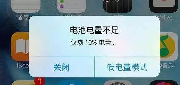
相信大家生活中也经常会遇到上方情况,本章节我们来模拟提示一个电量不足的显示,使用自定义弹窗来实现
提示电量不足
可以选择关闭和低电量模式
显示当前剩余电量
二、控件介绍
自定义弹窗:官方文档
说明: 从API Version 7开始支持。后续版本如有新增内容,则采用上角标单独标记该内容的起始版本。
通过CustomDialogController类显示自定义弹窗。
接口
CustomDialogController(value:{builder: CustomDialog, cancel?: () => void, autoCancel?: boolean, alignment?: DialogAlignment, offset?: Offset, customStyle?: boolean})
参数
| 参数名 | 参数类型 | 必填 | 默认值 | 参数描述 |
|---|---|---|---|---|
| builder | CustomDialog | 是 | - | 自定义弹窗内容构造器。 |
| cancel | () => void | 否 | - | 点击遮障层退出时的回调。 |
| autoCancel | boolean | 否 | true | 是否允许点击遮障层退出。 |
| alignment | DialogAlignment | 否 | DialogAlignment.Default | 弹窗在竖直方向上的对齐方式。 |
| offset | { dx: Length | Resource, dy: Length | Resource } | 否 | - | 弹窗相对alignment所在位置的偏移量。 |
| customStyle | boolean | 否 | false | 弹窗容器样式是否自定义。 |
| gridCount8+ | number | 否 | - | 弹窗宽度占栅格宽度的个数。 |
DialogAlignment枚举说明
| 名称 | 描述 |
|---|---|
| Top | 垂直顶部对齐。 |
| Center | 垂直居中对齐。 |
| Bottom | 垂直底部对齐。 |
| Default | 默认对齐。 |
| TopStart8+ | 左上对齐。 |
| TopEnd8+ | 右上对齐。 |
| CenterStart8+ | 左中对齐。 |
| CenterEnd8+ | 右中对齐。 |
| BottomStart8+ | 左下对齐。 |
| BottomEnd8+ | 右下对齐。 |
代码介绍:
declare class CustomDialogController {
  constructor(value: CustomDialogControllerOptions); // 对话框控制器,控制弹框样式等
  open();                                            // 打开对话框
  close();                                           // 关闭对话框
}

// 配置参数的定义
declare interface CustomDialogControllerOptions {
  builder: any;                                      // 弹框构造器
  cancel?: () => void;                               // 点击蒙层的事件回调
  autoCancel?: boolean;                              // 点击蒙层是否自动消失
  alignment?: DialogAlignment;                       // 弹框在竖直方向上的对齐方式
  offset?: Offset;                                   // 根据alignment的偏移
  customStyle?: boolean;                             // 是否是自定义样式
  gridCount?: number;                                // grid数量
}
CustomDialogController
导入对象
dialogController : CustomDialogController = new CustomDialogController(value:{builder: CustomDialog, cancel?: () => void, autoCancel?: boolean})
open()
open(): void
显示自定义弹窗内容,若已显示,则不生效。
close
close(): void
关闭显示的自定义弹窗,若已关闭,则不生效。
三、UI设计
(1)弹窗实现
本章节的UI设计特别简单,仅需要实现一个弹窗即可
开介绍,我们需要在@Entry外进行定义,定义类型是@CustomDialog,其基本结构如下(官网)
@CustomDialog
struct CustomDialogExample {
  controller: CustomDialogController
  cancel: () => void
  confirm: () => void

  build() {
    Column() {
      Text('Software uninstall').width('70%').fontSize(20).margin({ top: 10, bottom: 10 })
      Image($r('app.media.icon')).width(80).height(80)
      Text('Whether to uninstall a software?').fontSize(16).margin({ bottom: 10 })
      Flex({ justifyContent: FlexAlign.SpaceAround }) {
        Button('cancel')
          .onClick(() => {
            this.controller.close()
            this.cancel()
          }).backgroundColor(0xffffff).fontColor(Color.Black)
        Button('confirm')
          .onClick(() => {
            this.controller.close()
            this.confirm()
          }).backgroundColor(0xffffff).fontColor(Color.Red)
      }.margin({ bottom: 10 })
    }
  }
}
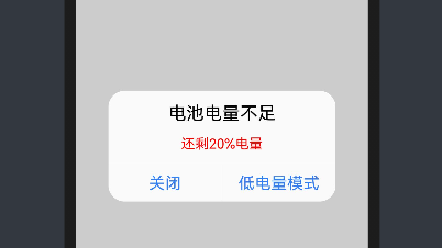
通过上面的程序可以实现下面的效果
我们需要对内容和格式进行修改
@CustomDialog
struct CustomBatteryDialog  {
  controller: CustomDialogController
  cancel: () => void
  confirm: () => void

  build() {
    Stack() {
      Column() {
        Text('电池电量不足')
          .fontSize(22)
          .margin({top: 15})
          .fontColor(Color.Black)
        Text('还剩20%电量')
          .fontSize(17)
          .margin({top: 15})
          .fontColor(Color.Red)
        Text()
          .size({width: "100%", height: "2px"})
          .backgroundColor("#bebbc1")
          .margin({top: 15})
        Row() {
          Text("关闭")
            .height("100%")
            .layoutWeight(1)
            .textAlign(TextAlign.Center)
            .fontSize(20)
            .fontColor("#317ef5")
            .onClick(() => {
              this.controller.close(); // 关闭弹窗
            })
          Text()
            .size({width: "2px", height: "100%"})
            .backgroundColor("#bebbc1")
          Text("低电量模式")
            .textAlign(TextAlign.Center)
            .fontSize(20)
            .fontColor("#317ef5")
            .height("100%")
            .layoutWeight(1)
            .onClick(() => {
              this.controller.close(); // 关闭弹窗
            })
        }
        .height(45)
        .width('100%')
      }
      .backgroundColor("#e6ffffff")
      .borderRadius(20)
    }
    .padding({left: 40, right: 40})
    .width("100%")
  }
}
实现效果如下:
(2)弹窗调用
弹窗调用的函数为this.controller.open(),一般是通过给定事件,像点击按钮或者之类,我们这里选择使用直接弹窗的形式(打开APP就弹窗)
使用到函数为onPageShow(),其位置在该位置:
@Entry
@Component
struct Index {

  onPageShow() {
    this.controller.open()

  }

  build() {

  }
}
四、系统演示
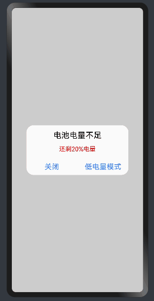
已实现效果,如上图所示。
编辑:黄飞
- 相关推荐
- 热点推荐
- ets
- OpenHarmony
-
#深入浅出学习eTs#(十)蓝药丸还是红药丸2023-05-17 2405
-
深入浅出学习eTs(一)模拟器/真机环境搭建2023-05-13 3576
-
#深入浅出学习eTs#(二)拖拽式UI2022-12-29 1804
-
#深入浅出学习eTs#(一)模拟器/真机环境搭建2022-12-24 1399
-
深入浅出学习低功耗蓝牙协议栈2021-06-23 1276
-
深入浅出学习250个通信原理资源下载2021-04-12 1132
-
深入浅出排序学习使用指南2019-09-16 1683
-
STM32深入浅出之新手篇2016-03-21 1425
-
ARM7 深入浅出的学习2012-12-04 3290
-
深入浅出Cortex-M0学习资料2010-06-18 1253
全部0条评论

快来发表一下你的评论吧 !
