

鸿蒙ArkTS声明式开发:跨平台支持列表【Popup控制】 通用属性
电子说
1.4w人已加入
描述
Popup控制
给组件绑定popup弹窗,并设置弹窗内容,交互逻辑和显示状态。
说明:
开发前请熟悉鸿蒙开发指导文档 :[gitee.com/li-shizhen-skin/harmony-os/blob/master/README.md]
从API Version 7开始支持。后续版本如有新增内容,则采用上角标单独标记该内容的起始版本。
接口
| 名称 | 参数类型 | 描述 |
|---|---|---|
| bindPopup | show: boolean, popup: [PopupOptions] | [CustomPopupOptions]8+ |
PopupOptions类型说明
| 名称 | 类型 | 必填 | 描述 |
|---|---|---|---|
| message | string | 是 | 弹窗信息内容。 |
| primaryButton | { value: string, action: () => void } | 否 | 第一个按钮。 value: 弹窗里主按钮的文本。 action: 点击主按钮的回调函数。 |
| secondaryButton | { value: string, action: () => void } | 否 | 第二个按钮。 value: 弹窗里辅助按钮的文本。 action: 点击辅助按钮的回调函数。 |
| onStateChange | (event: { isVisible: boolean }) => void | 否 | 弹窗状态变化事件回调,参数isVisible为弹窗当前的显示状态。 |
| arrowOffset9+ | [Length] | 否 | popup箭头在弹窗处的偏移。箭头在气泡上下方时,数值为0表示箭头居最左侧,偏移量为箭头至最左侧的距离,默认居中。箭头在气泡左右侧时,偏移量为箭头至最上侧的距离,默认居中。如果显示在屏幕边缘,气泡会自动左右偏移,数值为0时箭头始终指向绑定组件。 |
| showInSubWindow9+ | boolean | 否 | 是否在子窗口显示气泡,默认值为false。 |
| mask10+ | boolean | [ResourceColor] | 否 |
| messageOptions10+ | [PopupMessageOptions] | 否 | 设置弹窗信息文本参数。 |
| targetSpace10+ | [Length] | 否 | 设置popup与目标的间隙。 |
| placement10+ | [Placement] | 否 | 设置popup组件相对于目标的显示位置,默认值为Placement.Bottom。 |
| offset10+ | [Position] | 否 | 设置popup组件相对于placement设置的显示位置的偏移。**说明:**不支持设置百分比。 |
| enableArrow10+ | boolean | 否 | 设置是否显示箭头。 默认值:true |
PopupMessageOptions10+类型说明
| 名称 | 类型 | 必填 | 描述 |
|---|---|---|---|
| textColor | [ResourceColor] | 否 | 设置弹窗信息文本颜色。 |
| font | [Font] | 否 | 设置弹窗信息字体属性。 |
CustomPopupOptions8+类型说明
| 名称 | 类型 | 必填 | 描述 |
|---|---|---|---|
| builder | [CustomBuilder] | 是 | 提示气泡内容的构造器。**说明:**popup为通用属性,自定义popup中不支持再次弹出popup。对builder下的第一层容器组件不支持使用position属性,如果使用将导致气泡不显示。 |
| placement | [Placement] | 否 | 气泡组件优先显示的位置,当前位置显示不下时,会自动调整位置。 默认值:Placement.Bottom |
| popupColor | [ResourceColor] | 否 | 提示气泡的颜色。 默认值:'#4d4d4d' |
| enableArrow | boolean | 否 | 是否显示箭头。 从API Version 9开始,如果箭头所在方位侧的气泡长度不足以显示下箭头,则会默认不显示箭头。比如:placement设置为Left,此时如果气泡高度小于箭头的宽度(32vp)与气泡圆角两倍(48vp)之和(80vp),则实际不会显示箭头。 默认值:true |
| autoCancel | boolean | 否 | 页面有操作时,是否自动关闭气泡。 默认值:true |
| onStateChange | (event: { isVisible: boolean }) => void | 否 | 弹窗状态变化事件回调,参数为弹窗当前的显示状态。 |
| arrowOffset9+ | [Length] | 否 | popup箭头在弹窗处的偏移。箭头在气泡上下方时,数值为0表示箭头居最左侧,偏移量为箭头至最左侧的距离,默认居中。箭头在气泡左右侧时,偏移量为箭头至最上侧的距离,默认居中。如果显示在屏幕边缘,气泡会自动左右偏移,数值为0时箭头始终指向绑定组件。 |
| showInSubWindow9+ | boolean | 否 | 是否在子窗口显示气泡,默认值为false。 |
| mask10+ | boolean | [ResourceColor] | 否 |
| targetSpace10+ | [Length] | 否 | 设置popup与目标的间隙。 |
| offset10+ | [Position] | 否 | 设置popup组件相对于placement设置的显示位置的偏移。**说明:**不支持设置百分比。 |
示例
示例1
// xxx.ets
@Entry
@Component
struct PopupExample {
@State handlePopup: boolean = false
@State customPopup: boolean = false
// popup构造器定义弹框内容
@Builder popupBuilder() {
Row({ space: 2 }) {
Image($r("app.media.image")).width(24).height(24).margin({ left: -5 })
Text('Custom Popup').fontSize(10)
}.width(100).height(50).padding(5)
}
build() {
Flex({ direction: FlexDirection.Column }) {
// PopupOptions 类型设置弹框内容
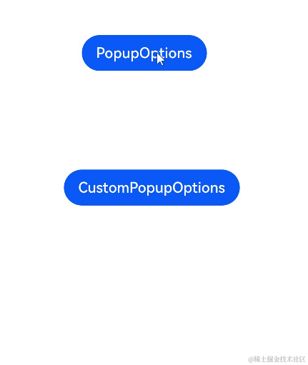
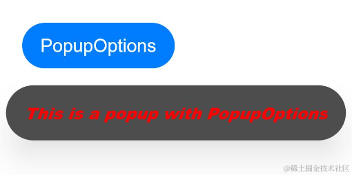
Button('PopupOptions')
.onClick(() = > {
this.handlePopup = !this.handlePopup
})
.bindPopup(this.handlePopup, {
message: 'This is a popup with PopupOptions',
showInSubWindow:false,
primaryButton: {
value: 'confirm',
action: () = > {
this.handlePopup = !this.handlePopup
console.info('confirm Button click')
}
},
// 第二个按钮
secondaryButton: {
value: 'cancel',
action: () = > {
this.handlePopup = !this.handlePopup
console.info('cancel Button click')
}
},
onStateChange: (e) = > {
console.info(JSON.stringify(e.isVisible))
if (!e.isVisible) {
this.handlePopup = false
}
}
})
.position({ x: 100, y: 50 })
// CustomPopupOptions 类型设置弹框内容
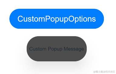
Button('CustomPopupOptions')
.onClick(() = > {
this.customPopup = !this.customPopup
})
.bindPopup(this.customPopup, {
builder: this.popupBuilder,
placement: Placement.Top,
mask: {color:'0x33000000'},
popupColor: Color.Yellow,
enableArrow: true,
showInSubWindow: false,
onStateChange: (e) = > {
if (!e.isVisible) {
this.customPopup = false
}
}
})
.position({ x: 80, y: 200 })
}.width('100%').padding({ top: 5 })
}
}
示例2
// xxx.ets
@Entry
@Component
struct PopupExample {
  @State handlePopup: boolean = false

  build() {
    Column() {
      Button('PopupOptions')
        .onClick(() = > {
          this.handlePopup = !this.handlePopup
        })
        .bindPopup(this.handlePopup, {
          message: 'This is a popup with PopupOptions',
          messageOptions: {
            textColor: Color.Red,
            font: {
              size: '14vp',
              style: FontStyle.Italic,
              weight: FontWeight.Bolder
            }
          },
          placement: Placement.Bottom,
          enableArrow: false,
          targetSpace: '15vp',
          onStateChange: (e) = > {
            console.info(JSON.stringify(e.isVisible))
            if (!e.isVisible) {
              this.handlePopup = false
            }
          }
        })
    }.margin(20)
  }
}

`HarmonyOS与OpenHarmony鸿蒙文档籽料:mau123789是v直接拿`
示例3
// xxx.ets
@Entry
@Component
struct PopupExample {
  @State customPopup: boolean = false

  // popup构造器定义弹框内容
  @Builder popupBuilder() {
    Row() {
      Text('Custom Popup Message').fontSize(10)
    }.height(50).padding(5)
  }

  build() {
    Column() {
      // CustomPopupOptions 类型设置弹框内容
      Button('CustomPopupOptions')
        .onClick(() = > {
          this.customPopup = !this.customPopup
        })
        .bindPopup(this.customPopup, {
          builder: this.popupBuilder,
          targetSpace: '15vp',
          enableArrow: false,
          onStateChange: (e) = > {
            if (!e.isVisible) {
              this.customPopup = false
            }
          }
        })
    }.margin(20)
  }
}
审核编辑 黄宇
声明:本文内容及配图由入驻作者撰写或者入驻合作网站授权转载。文章观点仅代表作者本人,不代表电子发烧友网立场。文章及其配图仅供工程师学习之用,如有内容侵权或者其他违规问题,请联系本站处理。
举报投诉
-
鸿蒙ArkTS声明式开发:跨平台支持列表【文本通用】2024-06-13 1708
-
鸿蒙ArkTS声明式开发:跨平台支持列表【无障碍属性】 通用属性2024-06-11 1407
-
鸿蒙ArkTS声明式开发:跨平台支持列表【多态样式】 通用属性2024-06-07 1346
-
鸿蒙ArkTS声明式开发:跨平台支持列表【菜单控制】 通用属性2024-06-06 2320
-
鸿蒙ArkTS声明式开发:跨平台支持列表【栅格设置】 通用属性2024-06-05 1430
-
鸿蒙ArkTS声明式开发:跨平台支持列表【形状裁剪】 通用属性2024-06-04 1332
-
鸿蒙ArkTS声明式开发:跨平台支持列表【显隐控制】 通用属性2024-06-03 1790
-
鸿蒙ArkTS声明式开发:跨平台支持列表【图片边框设置】 通用属性2024-05-31 1785
-
鸿蒙ArkTS声明式开发:跨平台支持列表【按键事件】2024-05-28 2023
-
HarmonyOS/OpenHarmony应用开发-ArkTS的声明式开发范式2023-01-17 2081
全部0条评论

快来发表一下你的评论吧 !
