

bootstrap如何使用_bootstrap基本使用方法
嵌入式操作系统
描述
Bootstrap是Twitter推出的一个由动态CSS语言Less写成的开源CSS/HTML框架(同时提供Sass 移植版代码)。Bootstrap提供了全面的基本及组件样式并自带了13个jQuery插件(模态对话框、标签页、滚动条、弹出框等),可满足常用开发需要,而且还根据需要定制。另外,Bootstrap提供了优雅的HTML和CSS规范,使用者也可以参考学习。
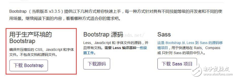
今天谈一下bootstrap,这个让我爱不释手的东西,惯例,我们先要去它的官网http://v3.bootcss.com进行下载:
点击红线边框处即可跳转到下载页面,有三个东西可以给我们选择,由于我们现在处于初级使用阶段,或者说我们直接用在生成环境下,我们下载第一个就好:
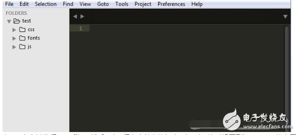
下载成功后可以得到一个.zip的文件,解压后我们可以得到一个包含css、fonts和js的文件夹,ok,准备工作我们就做好了。
现在要怎么用呢,一头雾水吧,我们新建一个文件夹,命名为test,将刚刚三个文件夹复制到test文件夹中,现在用sublime打开刚刚的文件夹,点击file-open folder,选择test文件夹点击确定即可,如下:
在test上右键选择new file,然后ctrl+s保存文件名为index.html,这时候回到bootstrap的官网,导航栏选择“起步”,向下拖动或在右侧选择“基本模板”,将下列代码进行复制,粘贴到index.html中,如下:
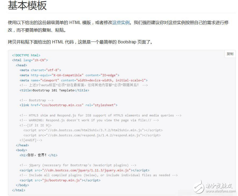
粘贴到sublime中,这是一个html5格式的html文件:
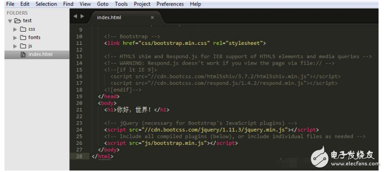
这时候我们点击index.html,浏览器打开后就可以在屏幕上看到一个Diao炸天的“Hello world”了。
到这里,其实你已经用bootstrap完成了第一个页面设计了。下面来具体说下bootstrap的具体使用方法,bootstrap其实是把网页等分为了12分,所以记住12这个数字是很重要的,可能这里你会比较模糊,下面我们来看下官方文档是怎么说的,我们先来了解一下“栅格参数”:
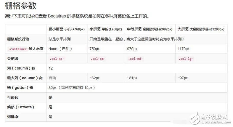
bootstrap把根据屏幕大小把屏幕分为了4个层级,小于768像素的为超小屏幕,大于等于768像素的为小屏幕,大于等于992像素的为中等屏幕,大于等于1200像素的则为大屏幕,相应的类前缀见图或查看官方文档,根据栅格参数,我们看下下面这幅图:
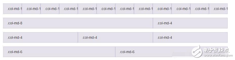
我们可以发现,每行的数字全部相加,最终都等于刚刚我让大家记住的12,可能大家还是不清楚,我们下面用一个例子来会说明:
如果我现在需要在页面上左右分别显示两个面板,面板上面显示相应的表格数据,且左侧列表占总宽度的3分之2,右侧的面板仅占3分之1,OK,下面我们来看看怎么做。
我们刚刚已经创建好了一个基本的页面布局,页面上显示了“你好,世界!”,现在我们在这个框架上面接着写:
在body中,我们删除刚刚的“你好,世界!”,新建两个div,如下:
[html] view plain copy print?
《div class=“col-md-8”》《/div》
《div class=“col-md-4”》《/div》
由于左侧占用3分之2,12的3分之2为8,所以上面一个div设置为8,剩下的一个设为4,好了,第一步完成了。
下面进行第二步,分别在8和4里面建立两个面板,在bootstrap官网找到面板,复制代码如下:
[html] view plain copy print?
《div class=“panel panel-default”》
《div class=“panel-body”》
Basic panel example
《/div》
《/div》
将这段代码分别粘贴到两个div下,最终代码如下:
[html] view plain copy print?
《pre name=“code” class=“html”》 《div class=“col-md-8”》
《div class=“panel panel-default”》
《div class=“panel-body”》
Basic panel example
《/div》
《/div》
《/div》
《div class=“col-md-4”》
《div class=“panel panel-default”》
《div class=“panel-body”》
Basic panel example
《/div》
《/div》
《/div》
这时候页面显示效果如下:

我们可以看到左侧的panel占据了页面的3分之2,右侧的仅为3分之1,第二步也完成了。
第三步,我们来创建表格,在bootstrap官网找到表格的代码:
[html] view plain copy print?
《table class=“table”》
《caption》Optional table caption.《/caption》
《thead》
《tr》
《th》#《/th》
《th》First Name《/th》
《th》Last Name《/th》
《th》Username《/th》
《/tr》
《/thead》
《tbody》
《tr》
《th scope=“row”》1《/th》
《td》Mark《/td》
《td》Otto《/td》
《td》@mdo《/td》
《/tr》
《tr》
《th scope=“row”》2《/th》
《td》Jacob《/td》
《td》Thornton《/td》
《td》@fat《/td》
《/tr》
《tr》
《th scope=“row”》3《/th》
《td》Larry《/td》
《td》the Bird《/td》
《td》@twitter《/td》
《/tr》
《/tbody》
《/table》
同样的,将这段代码粘贴到刚刚的两个panel中,代码如下:
[html] view plain copy print?
《div class=“col-md-8”》
《div class=“panel panel-default”》
《div class=“panel-body”》
《table class=“table”》
《caption》Optional table caption.《/caption》
《thead》
《tr》
《th》#《/th》
《th》First Name《/th》
《th》Last Name《/th》
《th》Username《/th》
《/tr》
《/thead》
《tbody》
《tr》
《th scope=“row”》1《/th》
《td》Mark《/td》
《td》Otto《/td》
《td》@mdo《/td》
《/tr》
《tr》
《th scope=“row”》2《/th》
《td》Jacob《/td》
《td》Thornton《/td》
《td》@fat《/td》
《/tr》
《tr》
《th scope=“row”》3《/th》
《td》Larry《/td》
《td》the Bird《/td》
《td》@twitter《/td》
《/tr》
《/tbody》
《/table》
《/div》
《/div》
《/div》
《div class=“col-md-4”》
《div class=“panel panel-default”》
《div class=“panel-body”》
《table class=“table”》
《caption》Optional table caption.《/caption》
《thead》
《tr》
《th》#《/th》
《th》First Name《/th》
《th》Last Name《/th》
《th》Username《/th》
《/tr》
《/thead》
《tbody》
《tr》
《th scope=“row”》1《/th》
《td》Mark《/td》
《td》Otto《/td》
《td》@mdo《/td》
《/tr》
《tr》
《th scope=“row”》2《/th》
《td》Jacob《/td》
《td》Thornton《/td》
《td》@fat《/td》
《/tr》
《tr》
《th scope=“row”》3《/th》
《td》Larry《/td》
《td》the Bird《/td》
《td》@twitter《/td》
《/tr》
《/tbody》
《/table》
《/div》
《/div》
《/div》
此时页面效果如下:
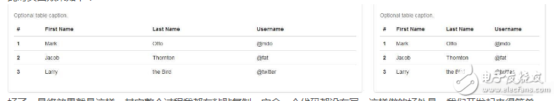
好了,最终效果就是这样,其实整个过程我都在粘贴复制,完全一个代码都没有写,这样做的好处是,我们开发起来很简单,而且兼容ie8以上、Firefox、Google等主流浏览器,基本方法就是这样,其余的一些效果不一一叙述,由于功能太多,方法都差不多,各位coder自己尝试一下吧!
- 相关推荐
- 热点推荐
- bootstrap
-
bootstrap框架用什么软件开发2024-07-11 1454
-
基于Bayes BootStrap的特种设备可靠性模型参数确定方法2023-10-24 480
-
ebpf的快速开发工具--libbpf-bootstrap2023-09-25 2546
-
如何使用SPIFFS快速提供Bootstrap内容?2023-02-28 585
-
Jekyll-Bootstrap Jekyll的增强版2022-06-09 504
-
Vim Bootstrap Vim配置文件生成器2022-05-23 814
-
wp-bootstrap WordPress主题2022-05-18 656
-
Coreos-bootstrap CoreOS主机启动程序2022-04-29 486
-
bootstrap时向量怎么设置?2020-06-17 1123
-
Bootstrap系统分析2019-10-23 1681
-
bootstrap和jquery区别2017-11-30 5860
-
bootstrap到底是用来做什么的2017-11-29 4721
全部0条评论

快来发表一下你的评论吧 !
